Today, we’re excited to unveil a new BlueWave Solar logo and website. It’s part of a rebranding campaign that we’ve been working on over the past year aimed at updating our visual identity to better represent the company that BlueWave has become. It’s sleek. It’s bold. It’s dynamic. And it’s the look that will carry us forward as we continue to grow in 2019 and beyond.
The new logo and website represent a major milestone in BlueWave’s history, a company that started in 2010 with a couple guys driving around in an old station wagon touting the benefits of solar to anyone who would listen. At the time, the BlueWave name didn’t even exist. But as the company started to grow the need for a name became obvious. Now I’ve always thought the BlueWave name represented a landscape covered in solar panels, blue-hued panels cascading over hills resembling a blue wave of clean energy spreading across the land. But that’s not quite right according to our co-founder and Chairman, John DeVillars.
In John’s words, “I wish there were a way to answer the question of how we came up with the name BlueWave as if there were an ingenious, enlightened, courageous, or similarly worthy response. There isn’t. But there was a reasonable measure of thought that went into the decision. The name BlueWave was chosen for the team for two reasons; one had to do with motion dynamics and the other with protecting the environment.”

John DeVillars alongside the Charles River - Boston Magazine, 2016.
John’s love of motion dynamics, a.k.a. speed, comes from his passion for race car driving, a sport in which John competed in the mid-90s across America and Mexico—although he admits his regret that these cars do not, yet, have electric engines! Says John, “Motion dynamics are the source behind the ‘Wave’ part of our name. Racing is about motion – advancing forward with power and force and speed, with the wind at your back. Those motion dynamics also create the forceful, fast moving, frothy waves that surfers thrive on and boaters respect. Speed, force, action, and risk are all embodied in those unrelenting waves."
While calling a wave blue may seem redundant, the blue portion of our name has deeper symbolism. Back in 1995 when John was naming the company, he was transitioning to the renewable energy industry from the Environmental Protection Agency (EPA), where he worked to restore and protect waterways throughout New England. While his new venture would not be specifically water-focused, the vision of his new company was to protect the planet, a world made up mostly of blue water. So in honor of a past dedicated to waterways and a future protecting the whole planet, BlueWave we became – merging the ideas of motion, water, energy, and planet.
“We do need a revolution to provide new options in solar."
Today, BlueWave is a team of nearly 100 employees working hard to protect the planet and deliver solar solutions to thousands of customers throughout the country. Our products and services have evolved since those early days, and while our name is a reminder of our commitment to a better planet, it became clear that our visual identity, no longer represented the company we’d become.
With our website, we set out to update the design and improve functionality. Beyond more streamlined navigation between our business lines and products, from community solar sales and services to solar finance and development, we’ve added more robust resources, including a Solar Resource Center and a powerful Support page. Our Resource Center is searchable by business line or resource type, making it a breeze to beef up your solar knowledge.

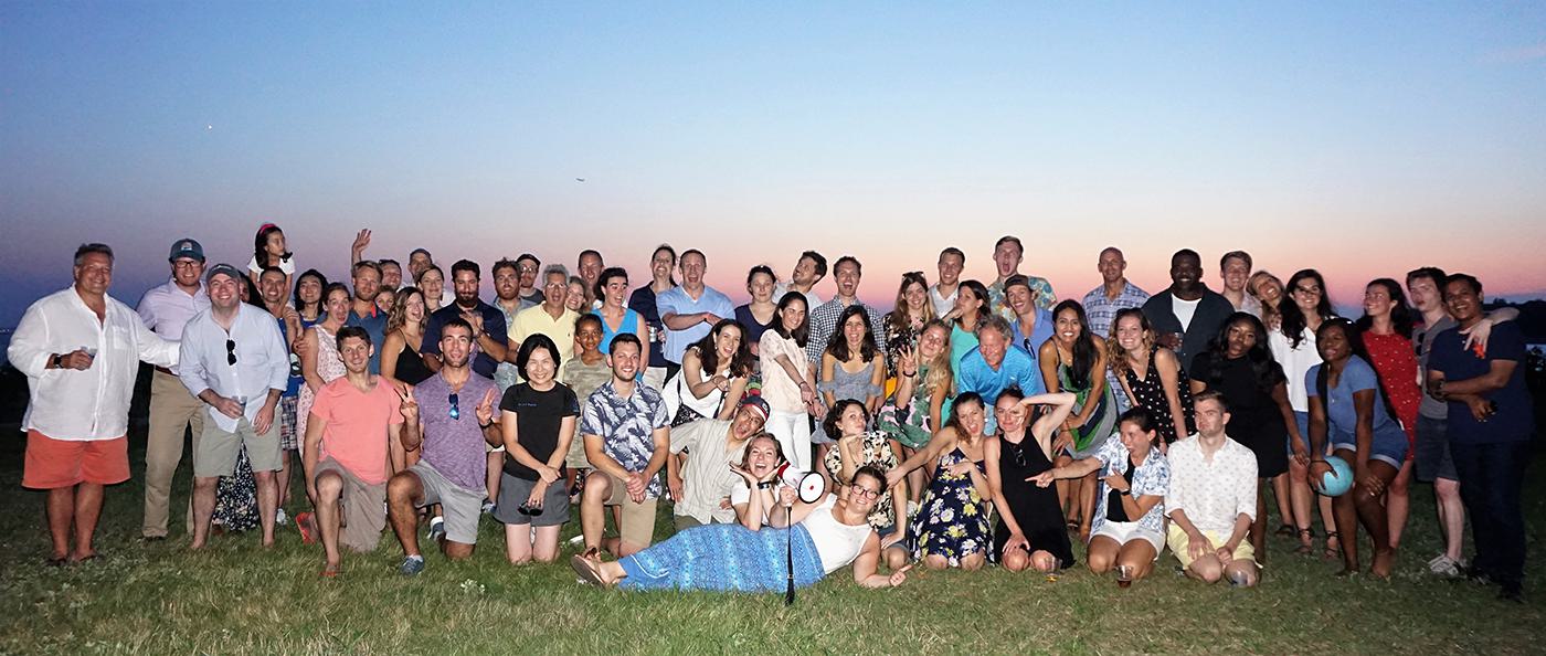
BlueWavers in their native habitat, enjoying a warm summer evening on Georges Island in Boston Harbor.
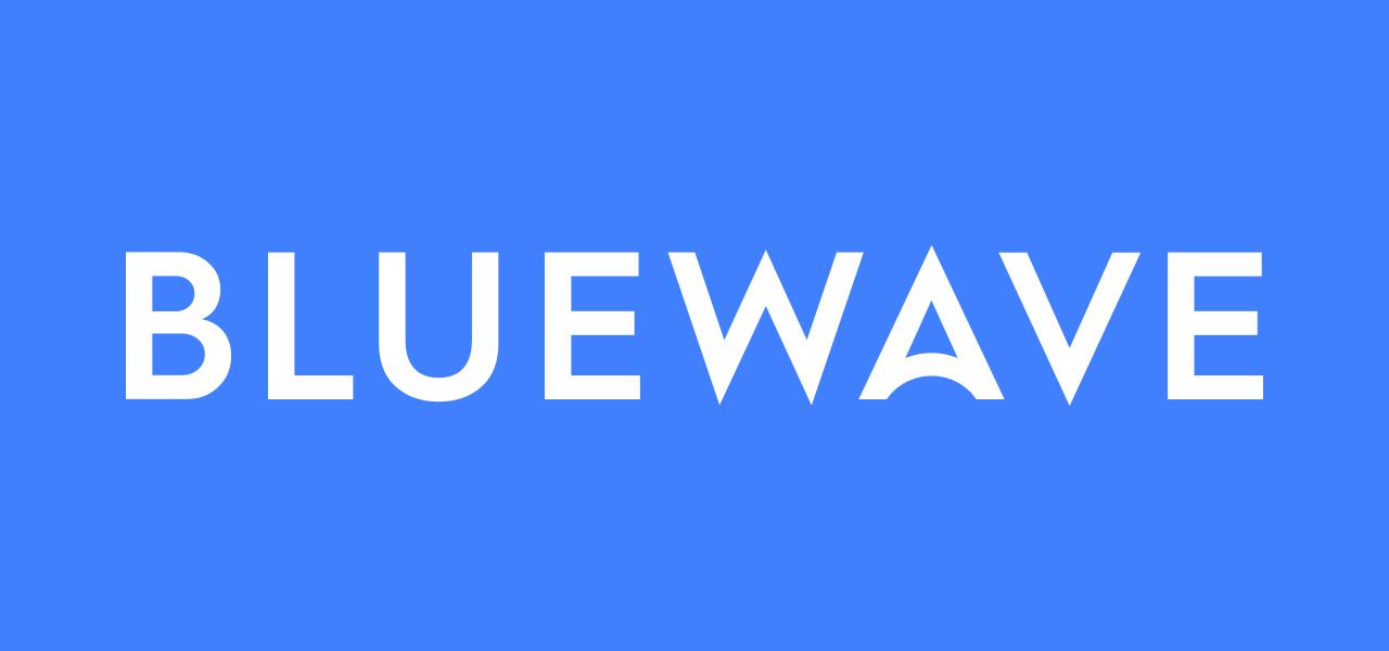
While we’ve come to love our original logo with its wave imagery, we needed a new logo with a strong visual cue to our core business line of solar energy and a better connection to our vision of protecting the planet. This is accomplished with our new logo design which shows the rounded shape of our planet, or a rising sun, integrated with the “A” in our name.
Despite designing our first logo himself, John says of the new logo, “The change in shape from wave to ‘rising sun’ not only connects us to the solar industry but also with our original vision of protecting the planet. The new bolder type-face shows we are entering a new era of urgency, where we do need a revolution to provide new options in solar.” Now, more than ever, working in the solar industry can feel like driving a racecar – challenging but exhilarating to work on the forefront of a new, critically important industry.

Introducing the new BlueWave logo
We’re thrilled with this new design and excited to roll out other design updates in the coming months. You’ll see a new typeface, color scheme, and iconography across all of our products and collateral as well.
It’s been quite a ride, and we’re sure this next phase will continue to be rewarding, exciting, and fun – new design and all. We see our brand and business as a continuously evolving project. While our vision keeps us motivated and our mission keeps us grounded, we are always striving to bring new models to the market to improve solar access for all.
What will BlueWave launch next? Sign up for our newsletter below to stay in the know!


